top of page
TravAlert
TravAlert is an iOS mobile app dedicated to ensuring the physical safety of travelers, creating a relaxed environment where users can feel secure without constantly being on guard.
Project Type
-
Brainstation Capstone
-
Solo Project
-
Passion Project
Role:
Tools Used:
-
UX Researcher
-
UX/UIDesigner
-
Figma
-
FigJam
-
Pen & Paper
-
Google Doc
-
Coffee
Project Timeline:
10 Weeks, May-July
Let's Begin The Journey!
Approach
Double Diamond Design Process
The Approach
For this project, I've utilized the double diamond technique, a valuable tool in design thinking that helps maintain focus throughout the process. In the diverge phase, I generated many ideas and explored numerous possibilities. During the converge phase, I narrowed down these ideas and began focusing on addressing a specific problem.

Overview
Traveling is meant to be relaxing and enjoyable, yet many travelers feel tense when visiting unfamiliar countries. It's natural to exercise caution and be mindful when making decisions in these situations.
My project is centered around creating a travel safety app that enhances the travel experience by offering travelers peace of mind. This app aims to streamline safety research, eliminating the need for travelers to juggle multiple platforms and creating a more organized approach. TravAlert addresses all safety concerns with its unique features, simplifying the process for users.
The Problem
Many Gen Z and Millennial travelers prioritize their safety, with approximately 60% willing to invest extra in travel insurance. Despite their eagerness to explore, about 85% expressed concerns regarding destination safety. The relaxed vacation mindset of tourists can make them susceptible to crimes, which often go unreported.
UX Research
85%
Of Gen Z and Millennials expressed some level of safety concerns when traveling
96%
Of people still travel despite threats and concerns
60%
Of Gen Z and Millenials are willing to invest in travel insurance before traveling
User Interviews
Diving deeper into the problem space through user interviews with individuals who fit the demographic which where ages between 25-30 that loves traveling around the world. I aim to understand their frustrations and identify common themes that contribute to the core issues faced by the majority.
What interviewees had to say
"I wouldn't go certain countries due the the high safety concerns and the main reason I would say is the high crime rate"
"I feel unsafe when walking alone, what if someone to were to target me and approach me threatening me for money"
"I always feel the need to only go to tourist friendly places in fear of being alone and in danger"
Affinity Mapping
After conducting interviews, I analyzed the themes and findings using an affinity mapping process, resulting in three major categories.
Identifying Common Themes
Preparing for unexpected situations
Participants fear getting lost in a foreign country, so they over-prepare by spending more on data and carrying extra money for unexpected situations like last-minute hotels or taxis, aiming to avoid inconveniences.
Physical safety concerns
Participants fear becoming targets for crimes in foreign countries, such as threats for money and scams, leading them to be cautious about walking alone or being out after dark, always staying on guard.
Transportation
Fear of transportation delays or changes can cause significant inconvenience during travel. Missing a train could mean hours of waiting for the next one, and missing a flight is even more difficult to manage.
Chosen Theme
The theme I focused on is physical safety concerns. Participants expressed a shared fear of becoming targets for crimes in foreign countries, including threats for money and falling victim to scams. They feel uneasy about walking alone in less populated areas and remain on high alert throughout their travels, impacting their ability to fully enjoy the trip.
Key Takeaways
My assumptions were validated through primary research, aligning closely with findings from secondary sources. The key takeaway from this research is that participants' concerns significantly impact their travel experiences. These concerns can lead them to avoid certain areas that they would otherwise like to visit, even if those areas are not typically tourist-friendly. Understanding these dynamics will guide me in approaching solutions to address these challenges effectively.
How might we help travelers ages 20 to 30 alleviate their physical safety concerns when it comes to traveling to their desired destination?
Creating a Solution
Persona
Knowing Who We Are Designing For
The persona that is going to represent this case study of travel safety is Sarina, a 25-year-old travel enthusiast who thrives on exploring new destinations with loved ones but also loves solo adventures. Despite her passion for independent travel, Sarah hesitates to travel alone due to concerns about her physical safety. She often worries about becoming a target for scams and muggings, a fear that has limited the frequency of her solo trips.

Experience Mapping
Whats the Journey?
The experience map provides a visual representation of the user's journey within the problem space, highlighting their experiences and frustrations. It serves as a valuable tool to identify key points where interventions can effectively address user frustrations and enhance their overall experience.

When is The Best Time For Intervention?
I've decided to intervene right after travelers land in their destination country. This is a pivotal moment to implement a safety feature, preventing potential issues during their trip. Travelers often encounter unexpected situations upon arrival, which can be overwhelming. By focusing on proactive prevention and providing solutions that promote relaxation, we aim to enhance their travel experience.
?
User Stories/Epics
First Step in Developing a Solution
This step involves diving deeper into the problem space to create user stories and identify epics that define the functionality of a digital solution. Based on the user demographic I've made over 30+ user stories, over 30 user stories were crafted to explore potential functionalities. From these stories, four epics were identified in total.

Epic #1
Epic #2
Epic #3
Epic #4
Location Sharing
Real Time Alerts
Emergency Assistance
Maps & Navigation
Maintain communication with family and friends
Updates of safety advisories in specific locations
Quick access to emergency assistance services
Interactive maps & navigation feature that helps navigate to unfamiliar areas
Chosen Epics
Primary Epic: Real Time Alerts
Secondary Epic: Emergency Assistance
Why Real Time Alerts?
Prevents users from getting into dangerous situations in the first place
Crimes don’t happen every day at the same location but real-time alerts will let users know
Can prepare users for unreadiness and be on guard
3 out of 3 interviewees have mentioned their concerns for physical safety when traveling. After conducting 20-30 user stories the Epics that made most sense is “real-time alerts” because this could easily avoid unwanted situations before even being in the alerted area
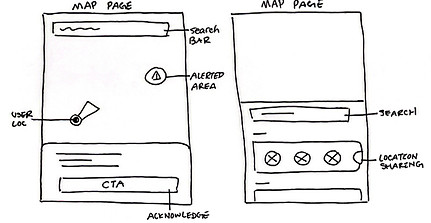
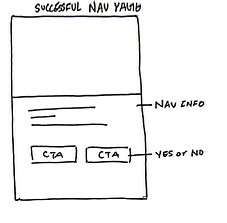
Task Flow
User Flow
Understand The User Flow Before Designing
Task: Set up a real-time location tracker on Trafety for a real-time alerts


We don't make mistakes, just happy little accidents
- Bob Ross
A happy little accident has occured during the task flow process. After wireframing and prototyping, I realized that the initial screens weren't sufficient to convey the solution effectively. Stepping back, I questioned whether the solution was effectively addressing the theme of preventing physical safety concerns for users. Recognizing this gap, I developed a second task flow that specifically targets the problem with a more comprehensive and ideal solution.

Sketching The Solution
Sketching
First Step in Ideating A Design
Sketching, in my opinion, is one of the most enjoyable aspects of UX design. While every part of the process has its appeal, sketching stands out for its ability to quickly ideate and visualize how wireframes might take shape, albeit in a more rapid manner. For each screen, I've created at least three exploratory sketches, focusing on honing the ideas before presenting the finalized solution sketches.

Mid Fidelity Wireframes
User Testing
The Skeleton of Screens
Based off of solutions sketches I translated them into mid fidelity wireframes on Figma. This step prepares me for user testing
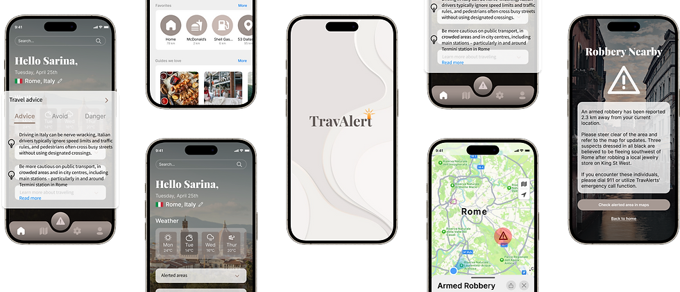
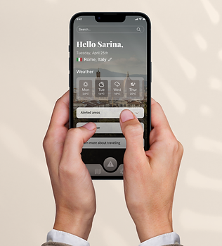
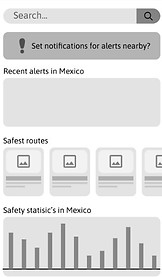
Sign In

Home

Alert Modal

Alert Information

Maps

Usability Testing #1
Is it Usable? Getting Feedback
I prototyped the first set of mid-fidelity wireframes and conducted user testing to assess their understandability and efficiency. My goal was to ensure that the task flow effectively conveys the message of travel safety to the users. There is a total of two rounds of user testing with five different participants each round.
Round 1 Feedback
Ver 1

Ver 2
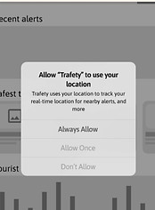
This section doesn’t allow users to choose “always allow”. Users were wondering if they closed the app or something refreshes then it would stop sharing their location to Trafety
Ver 1
Ver 2

This section should also be a notification pop up screen like the rest of the system decisions
Ver 1
Implementations

Users mentioned that the caution logo could become into a specific icon for the danger that is being alerted such as theft, thunderstorm, or suspicious activity.
Usability Testing #2
One More Time!
After incorporating most of the user feedback based on the design prioritization matrix, I've revised several screens and refined the prototype in preparation for the second round of user testing.
Round 2 Feedback
Ver 1
Ver 2

Users have the option to press exit themselves when they are done reading the notification which gives users control
Ver 1
Ver 1
Ver 2

Made the button to check maps hierarchy visible for users to press but they still have the option to go home
Ver 2

changed the look of the map so users could understand better on the alerted situation
Final Mid Fidelity Prototype
Final Step Before High fidelity Screens
After incorporating all user feedback according to the priority matrix, this prototype represents the final version.

Developing Brand Identity
Developing Brand Identity
Moodboard & Colour Pallet
Keywords
that best describe the mood, ambience, and atmosphere of Travalert
Clean
Professional
Modern
Ambient
Relaxed
Calm
Neat
Aesthetic
Light
Natural
Moodboard
A moodboard that portrays keywords. I selected cool and neutral tones for my moodboard to evoke a sense of calm, relaxation, professionalism, and neatness. Unlike many travel apps that are bright and overwhelming, I aimed to create an app that helps users transition to a relaxed state, considering they are often overwhelmed while traveling.


Chose one colour from the moodboard pallet to make it TravAlerts primary colour

Accent
Primary
Accent
Wordmark
Keywords
The sketches show my brainstorming for Travalert. I aimed for variety while ensuring the logo conveys its role as an alert app, distinct from a fun travel app. It's crucial that the logo speaks for the app's purpose clearly and effectively. After deciding a final wordmark from sketch I've implemented multiple designs on Figma.


Chosen Wordmark
I'd like the logo to be a simple wordmark—something elegant that won't overshadow the brand name but still conveys a sense of alertness.

Wordmark Logo
Application Icon
Font: Playfair Display (Black)
TravAlert Branding
I finalized the decision for brand colour, logo, and typeface
Brand Colour
Accent
Primary
Accent

Brand Typeface
Brand Logo


Considerations For Final Product
I used a UI inspiration board throughout the process to guide the final outcome of the high-fidelity prototypes. Following this, I conducted color injection testing to determine which version best represents TravAlert. When designing the high-fidelity prototype, I prioritized maintaining consistent user mental models, especially when it came to standard usability practices.


Final Prototype
UI Library
UI Library
Atoms, Molecules, Organisms Design System
The sketches show my brainstorming for Travalert. I aimed for variety while ensuring the logo conveys its role as an alert app, distinct from a fun travel app. It's crucial that the logo speaks for the app's purpose clearly and effectively. After deciding a final wordmark from sketch I've implemented multiple designs on Figma.


Marketing Website
Why Download TravAlert? Learn More About It
Marketing Website

Reflection
Tarot Cards of Tech
Question: What happens when 100 million people use your product?

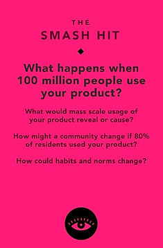
I'm Imagining 100 million users using TravAlert, I anticipate a significant reduction in travel safety concerns due to widespread adoption. Moreover, with such extensive usage, TravAlert can expand beyond travel—it can be used in users' hometowns for navigating with ease. I predict that the map feature could attract interest from large companies, potentially leading to collaborations across various platforms. Features like avoiding alerted areas or danger zones could become standard offerings. As an all-in-one travel app, TravAlert simplifies access to information and emergency calls, aligning with user habits and enhancing overall convenience in daily life.
Key Learnings & Next Steps
Important Things I've Learned in This Journey
Future Thinking
Key Learnings
This project has been my first passion case study, and over the course of 10 weeks, I've immersed myself in learning the UX process and its connection to human-centered design. Taking moments to reflect on why I'm designing is crucial because it's easy to get caught up in the process.
Through this journey, I've gained a deeper understanding of Figma, and I now feel much more confident using it. I've also realized the importance of persistence; achieving the desired outcome often requires multiple attempts. Initially, some goals may seem daunting, but with dedication and perseverance, anything is achievable.
Next Steps
There are certainly areas I can revisit and refine, and I plan to add more user task flows to enhance the project. Ultimately, I'm going to make an appearance on Shark Tank pitching this idea to the Sharks. Don't miss out on the next episodes, I might just be on the show.
Thank You For Scrolling!
Let's connect, I would love to chat!


bottom of page