Lowe Boats Checkout Process
A heuristic evaluation focuses on Lowe Boats' boat selection and checkout process. Lowe Boats is known for crafting exceptional aluminum boats at competitive prices and delivering memorable water experiences, Lowe faces the risk of potential customers not being able to successfully checkout due the usability challenges. Therefore, this case study aims to identify usability violations and implement improvements accordingly.
Project Type
-
Group Project
-
Heuristic Evaluation
Role:
Tools Used:
-
UX Researcher
-
UX/UIDesigner
-
Figma
-
FigJam
-
Pen & Paper
-
Google Doc
Project Timeline:
2 Weeks, June 2024

With a focus on producing the finest aluminum boats at the best price, Lowe is pushing the boundaries of what is possible on the water. From the bass-hammering Stinger Series, to the walleye-dominating Fishing Machine Series, to the premium comfort of our extensive line of pontoon boats, we’re dedicated to making your time on the water the stuff that memories are made of.
The Challenge
Heuristic Evaluation and Redesign
The primary goal of this challenge is to pinpoint usability violations using Jakob Nielsen's 10 heuristics. Identifying these violations was relatively straightforward, supported by statistics revealing a high bounce rate of 48% during the checkout process and 100% percent of users were using desktops.
48%
Bounce Rate
100%
Desktop Users
Now that the team have identified the source of the problem, it allows for a more focused evaluation. The team has chosen to prioritize desktop redesigns, particularly focusing on the checkout process, given that nearly half of the users are abandoning the website because of it. This suggests there may be usability issues causing confusion among users.
The Approach
Jakob Nielson's 10 Heuristics
The team used Jakob Nielsen's 10 heuristics for user interface to guide this project, by identifying which laws are violated and providing a structured approach to resolve usability issues. This method aims to enhance usability and foster increased user engagement with the website.

Severity Rating
Severity Ratings For Usability
The severity of the usability issues determines the priority rating, indicating which sections should be addressed more urgently than others.
1
Cosmetic
Minor issues that have no impact on usability
2
Minor
Small issues that degrade the experience
3
Moderate
Issues that affect usability but aren't serious
4
Serious
Impede usability and cause confusion or frustration
5
Critical
Issues that prevent users from completing a task
Check Out Task Flow
User's Journey For Checking Out
Our team focused on evaluating the boat selection and checkout process on Lowe Boats' desktop website. This focus is critical as it directly impacts Lowe Boats' ability to secure potential purchases.

User lands on the Lowe Boats homepage
User selects the boat that interests them and proceeds to the information page
The user decides to build and price the boat after reading the specs
The user submits the quote and their contact for a sales representative to answer their questions about the build
Lowe Boats Checkout Process
Heuristic Evaluation Report
Heuristic Evaluation
#1 Consistency & Standard
Navigation Bar
Violation:
-
The logo is not left-aligned, and there is no clear reason for the "Build" button in the navigation bar.
-
Lots of unnecessary options gathered at the same place

1
Minor issues that have no impact on usability
Possible Solution:
Change the navigation bar to a tradition one instead, keeping user mental mode for more consistency
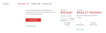
#2 Visibility of System Status
Build & Price
Violation:
In this information section, the “Build & Price”
button is highlighted in red. Although it is a CTA,
it’s giving the impression that you’ve navigated
to the “Build & Price” section causing confusion
for the user. You also aren’t able to select any of
the boats below to price.
2
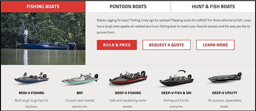
Small issues that degrade the experience
Possible Solution:
To make it easier for users to understand is to change it to a boat-picking carousel to make it easier for users to navigate through all the boat options in that specific section without confusion. Once you click on "Build & Price" it will actually lead you to that page
#3 User Control & Freedom
Boat Selection
Violation:
This page is when a user has already selected a boat to learn more information on, but if users accidentally clicked on this or changed their mind and wants to navigate to the previous page then there is no way to do that other than to click the back button on their desktop

5

Issues that prevent users from completing a task
Possible Solution:
By adding a back button allows users to freely navigate the page and return to the previous page with no frustrations
#4 Error & Prevention
Boat Selection
Violation:
In this page the “trailer accessories” section has 2 options that are completely not pickable but doesn’t show users that it is unavailable and this could lead to confusions because users can mistaken it for their desktop not working properly etc

1
Minor issues that have no impact on usability

Possible Solution:
Can prevent confusion by greying out or deleting the options for accessories that are unavailable
#5 Consistency & Standard
Boat Selection Summary
Violation:
This is the summary page after users filled out all needed information on building their custom boat but it does not show the summary of the boat they build but instead a personal information fill in section but no where on the screen shows the summary of the boat


5
Issues that prevent users from completing a task
Possible Solution:
Change the summary section into a order summary section for users to double check the details of their order before proceeding to checkout
#6 Help & Documentation
FAQ Section
Violation:
This is the websites bottom information section but our team realized that there wasn’t a FAQ section and it’s important to have one for answering frequently asked questions
5

Issues that prevent users from completing a task
Possible Solution:
Add a FAQ section for frequently asked questions to better support users
Lowe Boats Checkout Process
Redesign
Style Guide
Lowe Boats Style Guide
When redesigning a for an existing brand it is crucial to follow the style guide they have already established or if a new colour were to be introduced at least have the colour harmonize with the rest of the branding colours
Logo

Typeface

Brand Colours
Checkout Process Redesign
Navigation Bar
Before

After

Navigation bar is left aligned, navigation bar is bigger and more noticeable.
Build & Price
Before
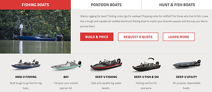
After

Changed the bottom of the Build & Price section by removing the boats and making it into a boat-picking carousel. By doing this users can look at the boats with less confusion.
Boat Selection
Before

After
Added a back button on the left side of the page, users can easily find their way back to the previous page with no confusion.
Boat Selection
Before
After

Greyed out and added "N/A" to the boat accessories that weren't available for the specific boat the user has chosen. The reason why our team didn't remove the section is because we still want users to know that option is available but just on another boat.
Boat Selection Summary
Before

After

Changed the summary section to a order summary section, this is the step for users to double check their boat before proceeding to fill in personal information and payment methods.
FAQ Section
Before
After